Imagine trying to concentrate on a high-focus written task in a room coloured entirely in red. Chances are that you’d feel agitated, distracted, and possibly even hungry.
Then imagine trying to create a wonderful piece of art in a muted, grey room with grey furniture and nothing on the walls. You wouldn’t feel inspired, but you might feel calm, or even anxious if you’ve spent a lot of time in medical settings.
Why? Colour influences our emotions, behaviour, readiness to learn, and creativity.
As you’ll see, research has proven that colour, when used carefully, is an important tool to help educators establish the right mindset and atmosphere for specific tasks and subjects. Colour can also impact students’ eye strain, degree of stimulation, fatigue levels and concentration.
This guide contains everything you need to know about the psychology of colours, how to apply these in your learning environment design – whether it’s a classroom, library or studio – and products to get you started.

Research: Understanding the Impact of Colour
According to the International Association of Colour Consultants – North America (IACC-NA), a school’s physical environment impacts students in powerful psychological and physiological ways:
“Appropriate colour design is important in protecting eyesight, in creating surroundings that are conducive to studying, and in promoting physical and mental health.”
The physiological effects of colour
In 1979, Dr. Alexander G. Schauss presented his findings on the scientific basis for colours’ effect on humans:
“Colours are electromagnetic wave bands of energy. Each colour has a certain wavelength. The wave bands stimulate chemicals in your eye, sending impulses of messages to the pituitary and pineal glands near the brain.
These are the master endocrine glands that regulate hormones and other physiological systems in the body. Stimulated by response to colours, glandular activities can alter moods, speed up heart rates and increase brain activity.”
This unconscious connection between the eyes, brain and body results in different physiological responses to colours. While many responses are similar across all humans, the relationship between colour and emotion is closely connected to colour preferences, plus cultural and social influences.
The effect of colour on learning outcomes
Much research exists on the colour impact on youth’s activities and learning:
- Engelbrecht (2003) found that the colour of classroom walls affects productivity and accuracy.
- Brubaker (1998) reported that cool colours can encourage concentration.
- In a study by Bross and Jackson (1981), the children made fewer errors when working in cubicles painted in their preferred colour. Well-liked colours have a positive effect on muscle tension as well as motor control skills.
- One study found that using students’ preferred colours – like light blue, yellow, yellow-green, and orange – could raise IQ by as much as 12 points compared to white, black, and brown which may be less appealing. The more popular colours also stimulated alertness and creativity, while the unpopular colours made children less attentive.
- Sinofsky and Knirck (1981) found that colour influences attitudes, behaviours, and learning partially because colour affects a student’s attention span and both their, and their teachers’, sense of time.
In addition to the various effects discussed above, colour affects student learning in the following ways:
- The use of colour enhances brain development through visual stimulation, which makes stronger connections in the brain while fostering visual thinking, problem-solving, and creativity.
- Using a variety of colours reduces boredom and passivity, improving attention span by avoiding a monotonous environment.
- Using colours in the classroom helps students stay focused through careful regulation of mental stimulation, which increases productivity and accuracy.
- Colours like red and orange affect blood pressure and heart rhythm, increasing the attention span of children, which then in turn benefits their learning.
- Numerous studies have demonstrated the ability of colour to impact blood pressure, including a Wohlforth and Sam (1982) study that observed a reduction in blood pressure and aggressive behaviour, even in visually impaired children, after changes in colours are applied to their environment.
Based on the above, colour psychology isn’t just a fad, it is a vital tool that can be incorporated into your pedagogy and classroom design for better learning outcomes.
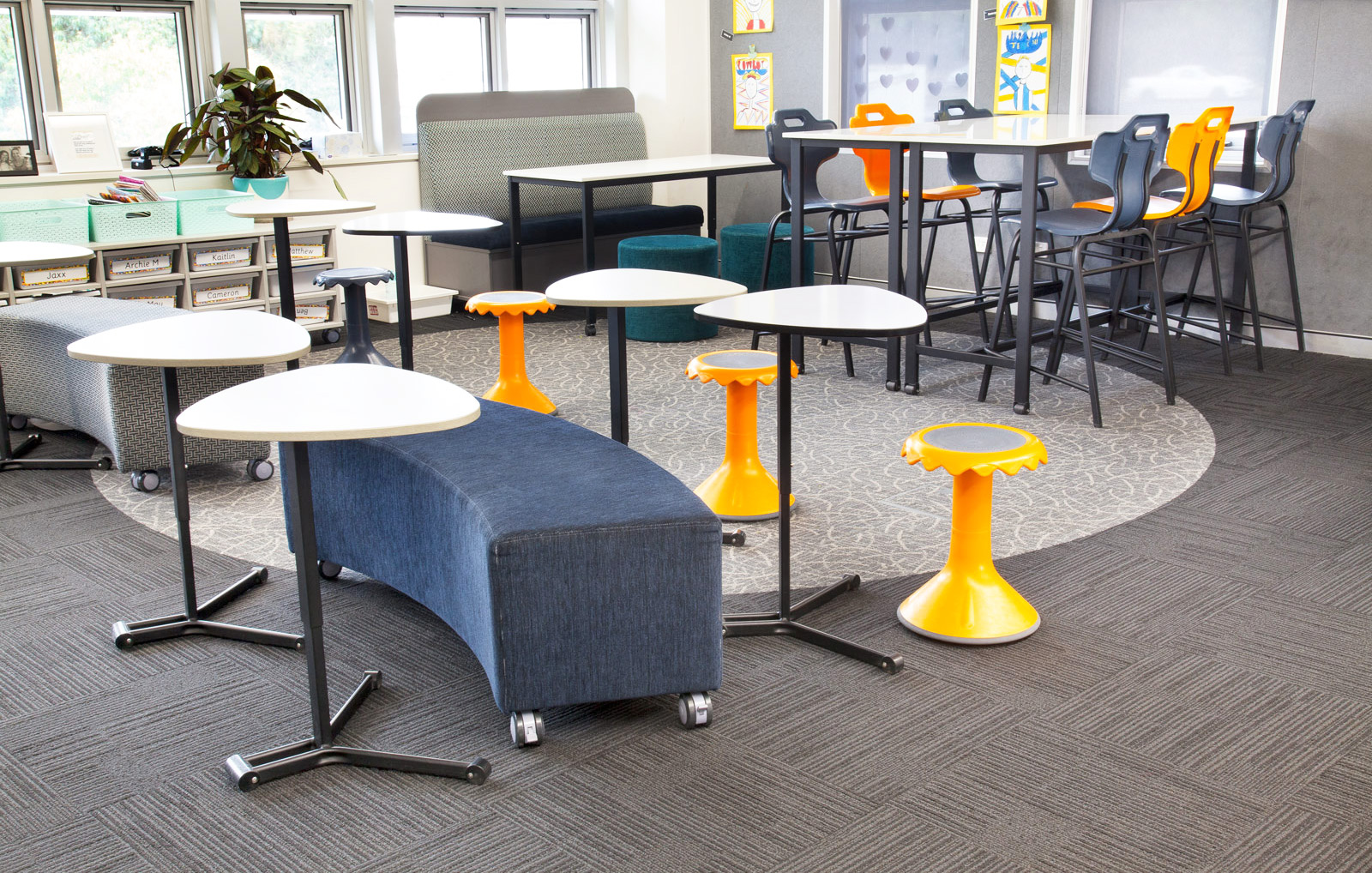
Understanding Colour in the Learning Environment
Using colour to create an optimal learning environment requires consideration of several factors: the level of energy you need in that room, the type of tasks being completed, the age of the learners, and the behaviour and emotions you want to evoke.
Firstly, let’s look at colour preferences for different age groups
As we grow older, our colour preferences and what colours signify to us, change. Research by the Institute of Colour Psychology found the following colour preferences for different ages:
- Most children do not prefer black, white, grey, and brown
- 5- to 8-year-olds prefer red, orange, yellow, and violet
- 9- to 10-year-olds prefer red, red-orange, and green-blue
- 11- to 12-year-olds prefer green and yellow
- 13- to 14-year-olds prefer blue, ultramarine, and orange
This means that different age groups are likely to relate better to certain colour schemes:
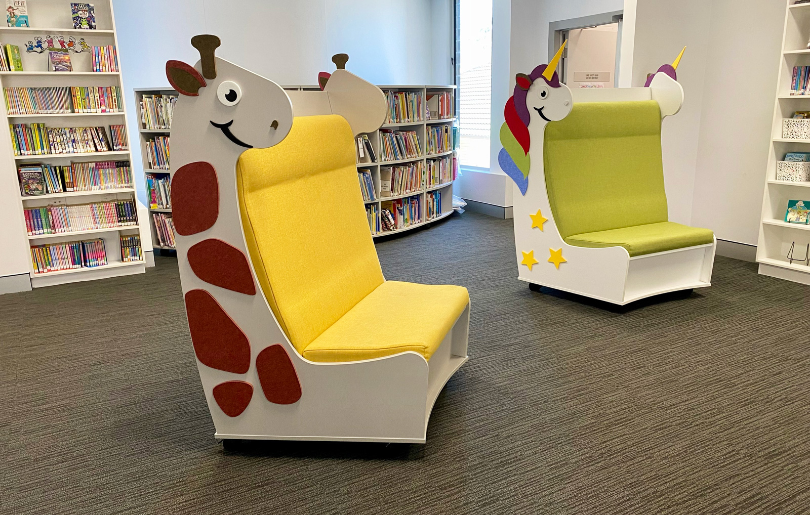
- Pre-school and younger primary school learners work well in bright and warm colours, like red, yellow, and orange.
- Older primary and secondary school learners typically believe primary colours (red, yellow, and blue) are immature, and they tend to prefer cooler colours and more subdued hues. They often work better with tints and pastel shades on main classroom walls, floors and ceilings.
- Adolescents relate better to darker and cooler colours, particularly for maths and science, which keep them calm and focus their concentration.
When to use certain colours
Considering the research above and the colour wheel below, we can see that different colours evoke different reactions, so we suggest beginning your colour selection process by identifying the focal point of each activity setting, such as reading, art, science experiments, group work etc.
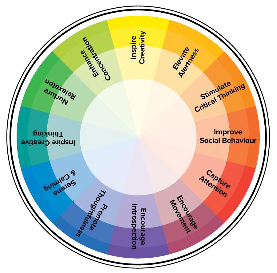
Blues
- Calming
- Promote thoughtfulness
- Encourage introspection
Shades of blue work well for walls and furniture in spaces where students must focus on what they are reading or doing such as mathematics activities or scientific experiments, rather than what might be happening around them.
Medium-toned blues also work well at the front of the classroom, where it relaxes students’ eyes and allows them to focus on a teacher and the writing or presentation on the board.
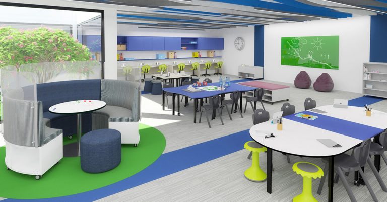
Furniture Tip: At BFX, blue, charcoal and green are our most popular colours due to their calming and concentration-enhancing properties. Our polyplastic chairs in Capri Blue, Charcoal and Eucalypt are ideal for classrooms and complement many other feature colours for walls, rugs, AudioArt board installations and upholstered surfaces.
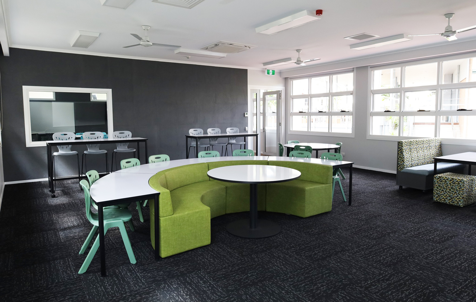
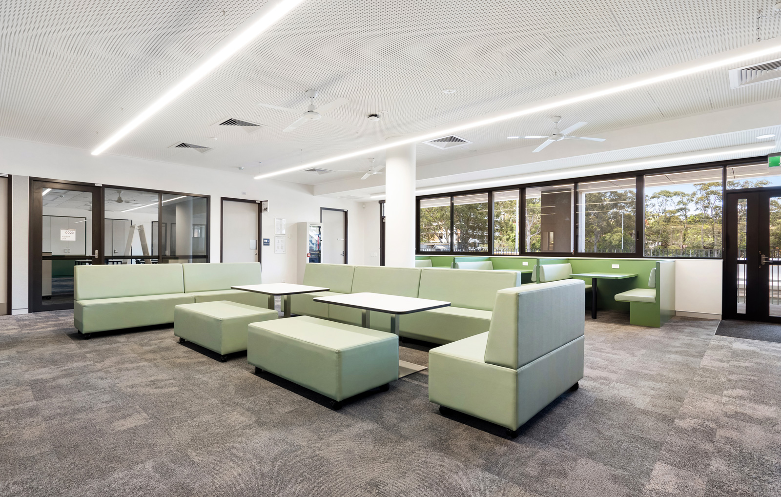
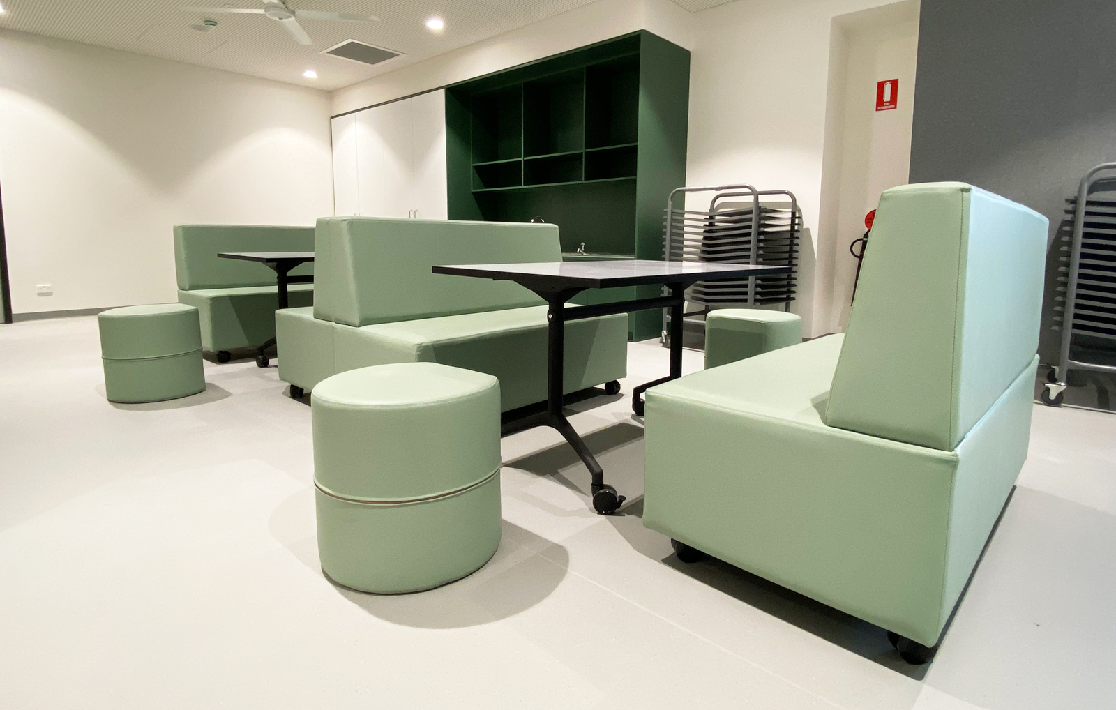
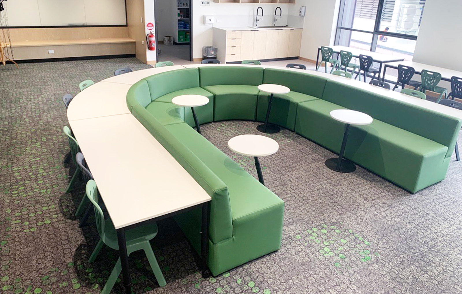
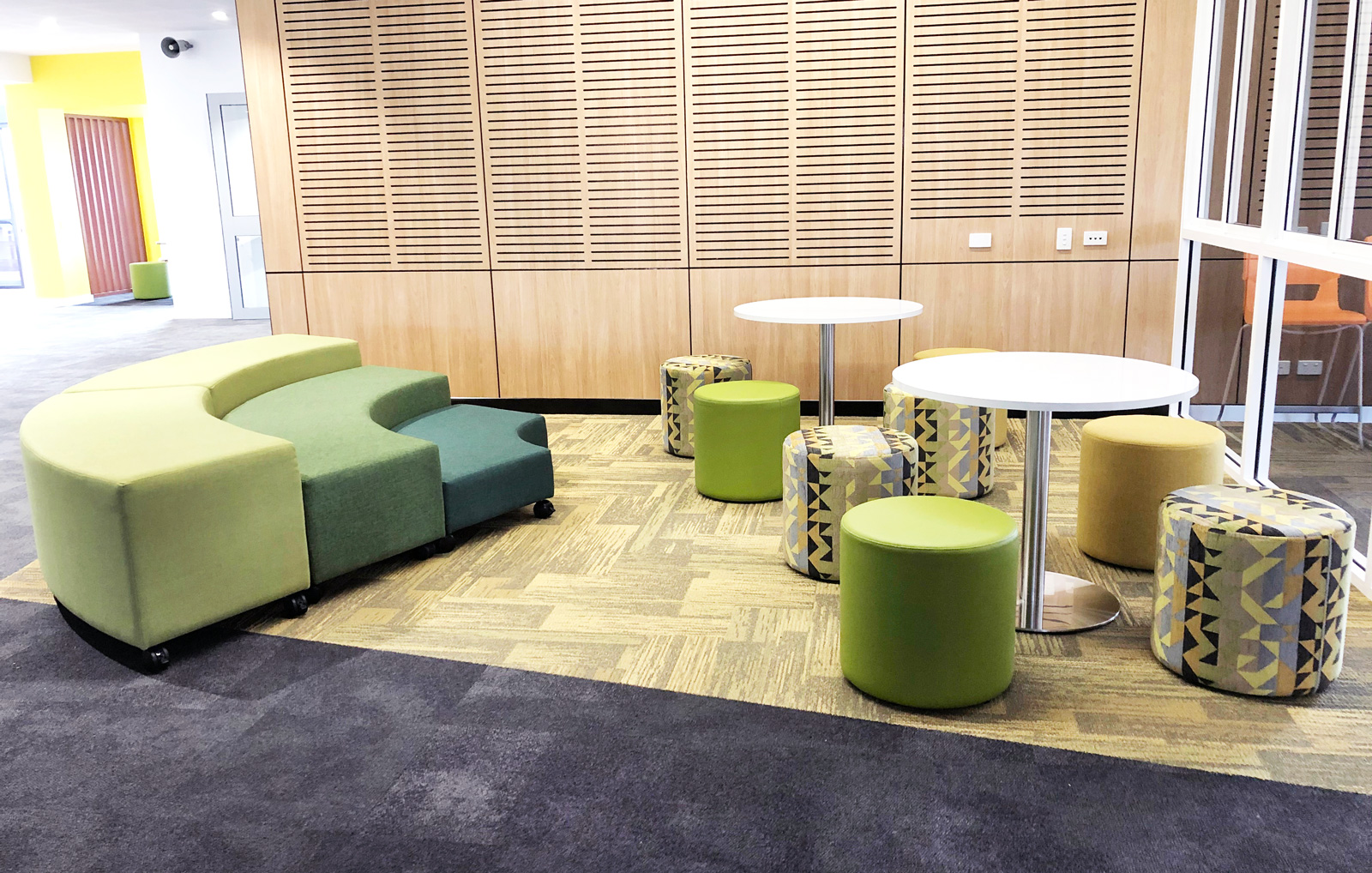
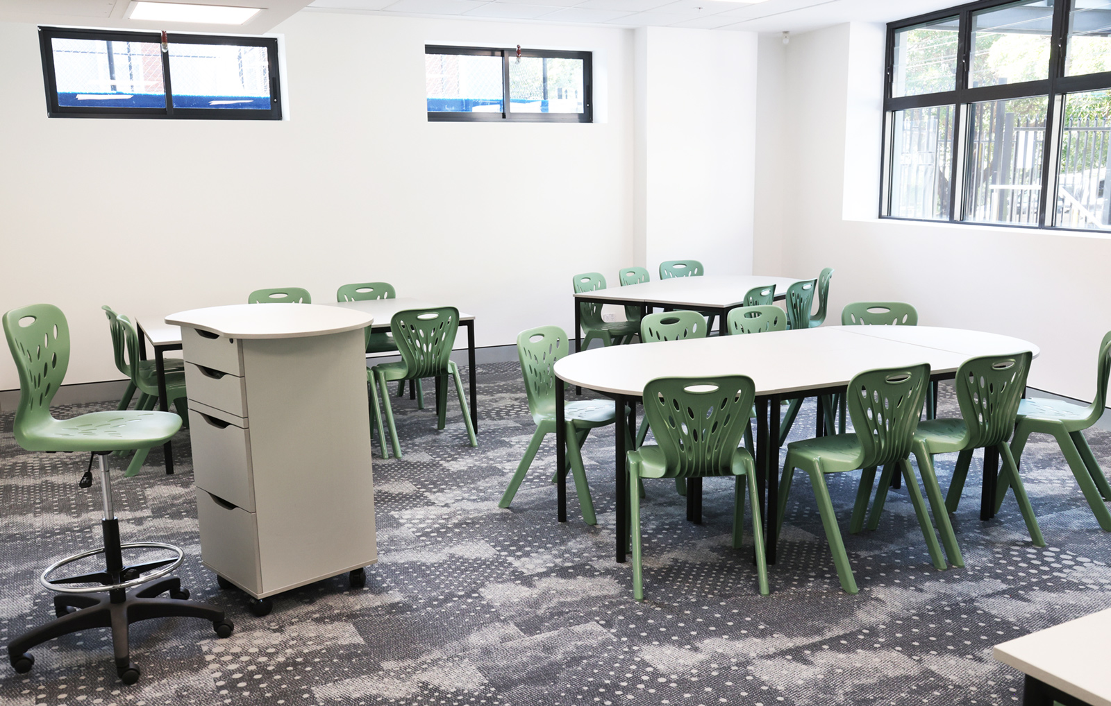
Greens
- Enhance concentration
- Nurture relaxation
- Inspire creative thinking
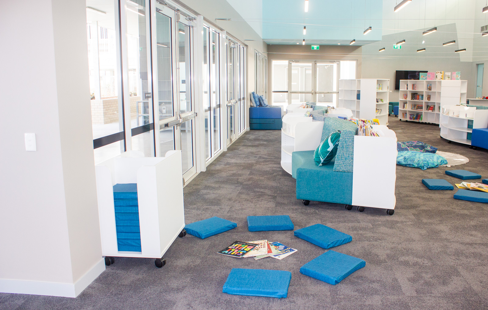
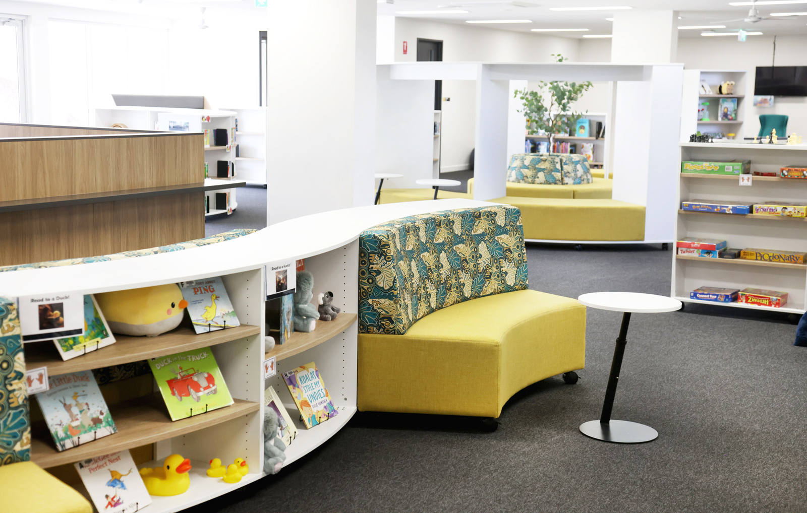
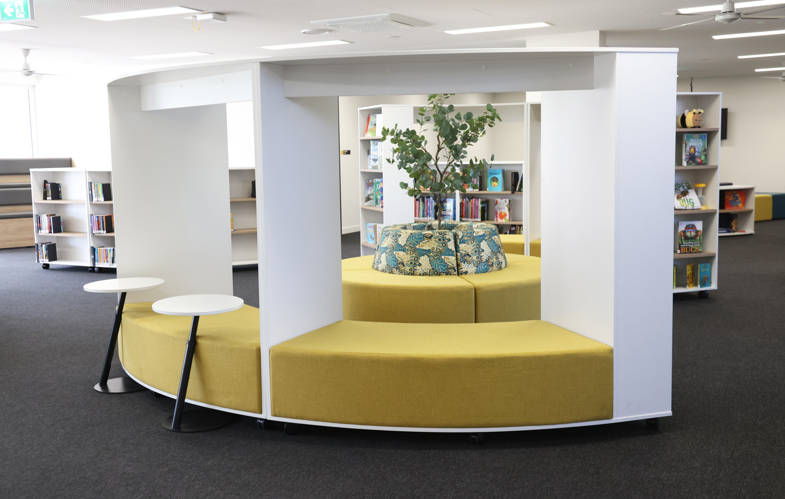
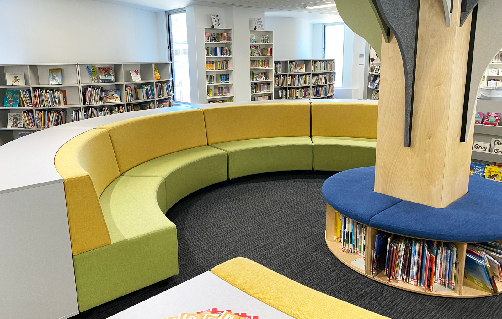
Pale or light green walls with darker furniture accents are a good choice for libraries, reading areas, and creative writing tasks when quiet and concentration are needed.
A medium-toned green would work well as the wall colour at the front of a classroom for children in upper primary levels.
Furniture Tip: Our Beachcomber fabrics in Fern and Kiwi are ideal for library seating like the Cirkus Mobile Lounge or Dino Diplo Den Reading Chair.
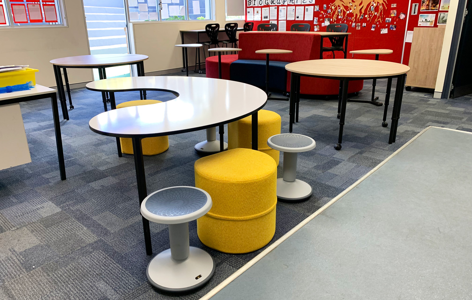
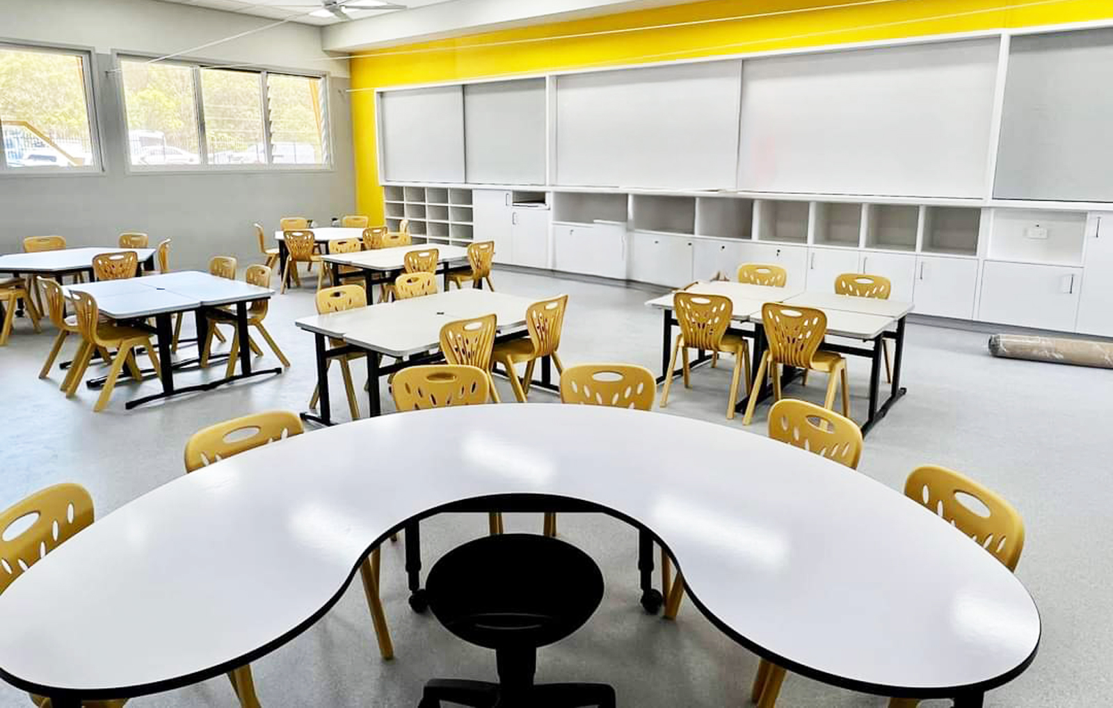
Yellows
- Inspire creativity
- Elevate alertness
- Encourage spontaneity
Light yellow provides a suitable background for art studios and creative activity areas.
Yellow appeals to young children so is often included in early primary school colour palettes.
Furniture Tip: Brighten up the mood in lower-primary classrooms with small yellow stools, lounges, and decorative accents like this AudioArt 3D lightbulb, the submarine cubby house or the Elements Rectangle Rug.
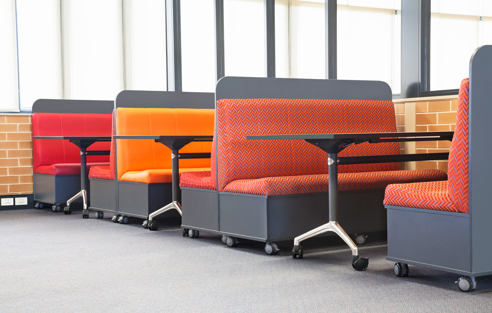
Reds
- Capture attention
- Encourage movement
- Promote alertness
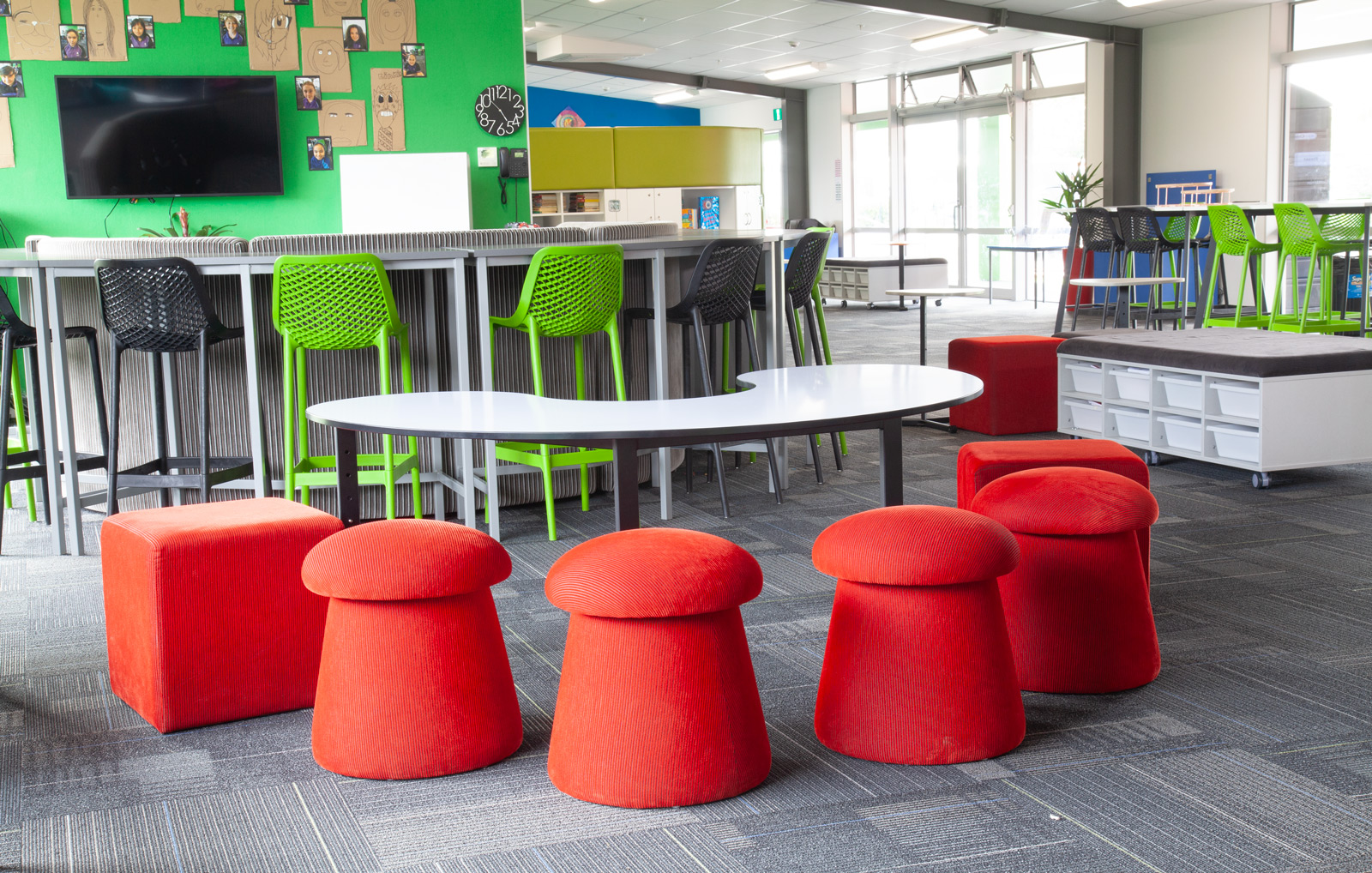
Red is useful as a highlight colour for drawing attention to certain areas. It’s a good inclusion in preschool and younger primary school classrooms since it is an energetic colour that reflects young children’s extroverted natures. However, be cautious about using brighter reds on entire walls as it can be overstimulating.
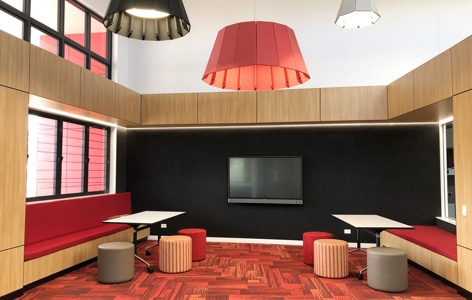
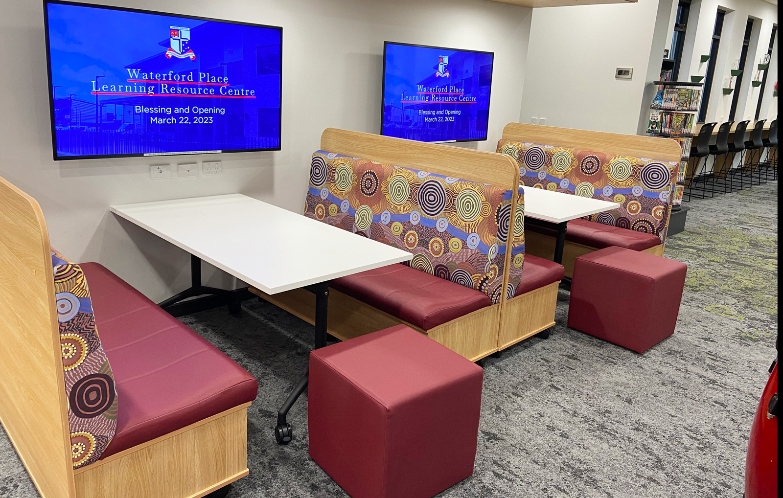
Deep burgundy, however, can work well in secondary education settings such as auditoriums, music and drama spaces.
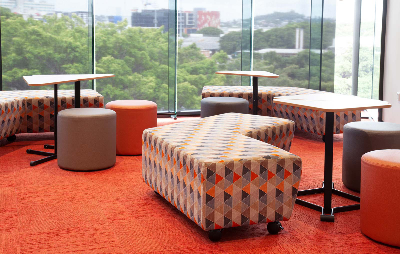
Furniture Tip: Use AudioArt Peel and Stick Tiles, ottomans with red fabric, or a red rug to create a high-energy zone in your classroom.
Oranges
- Improve social behaviour
- Cheer the spirit, and lessen hostility and irritability
- Stimulate critical thinking and memory
Orange is similar to red in its effects, though it is less stimulating. We recommend using it as an accent colour or to pull focus to a particular point in the room, rather than for entire walls.
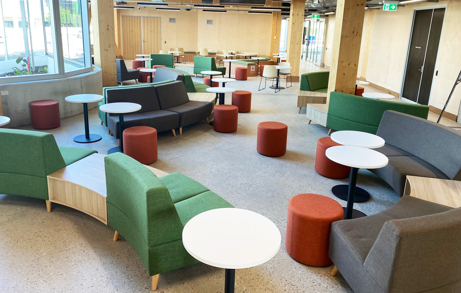
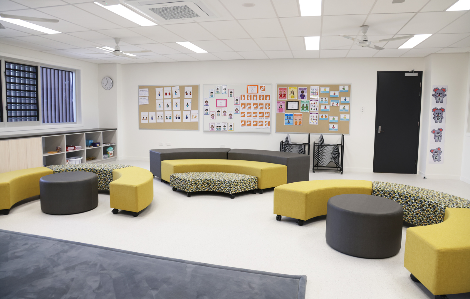
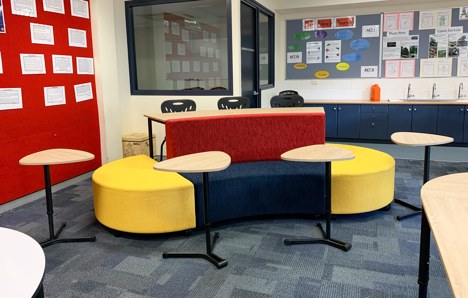
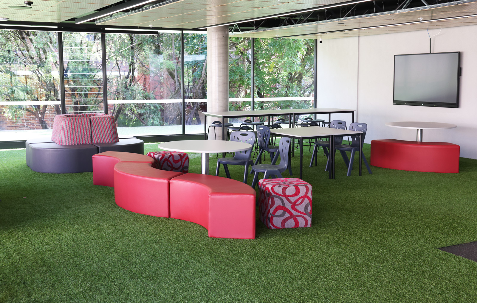
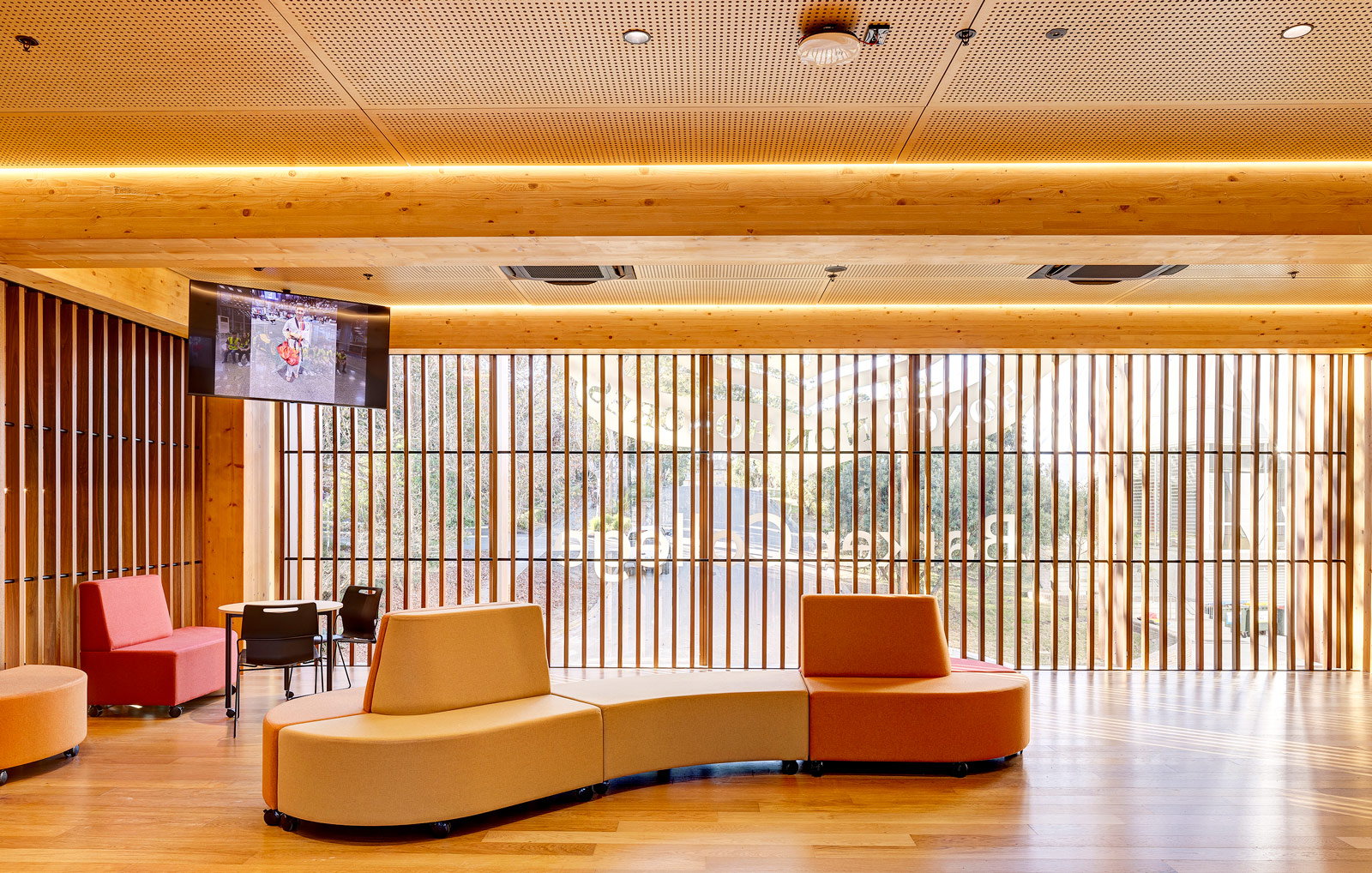
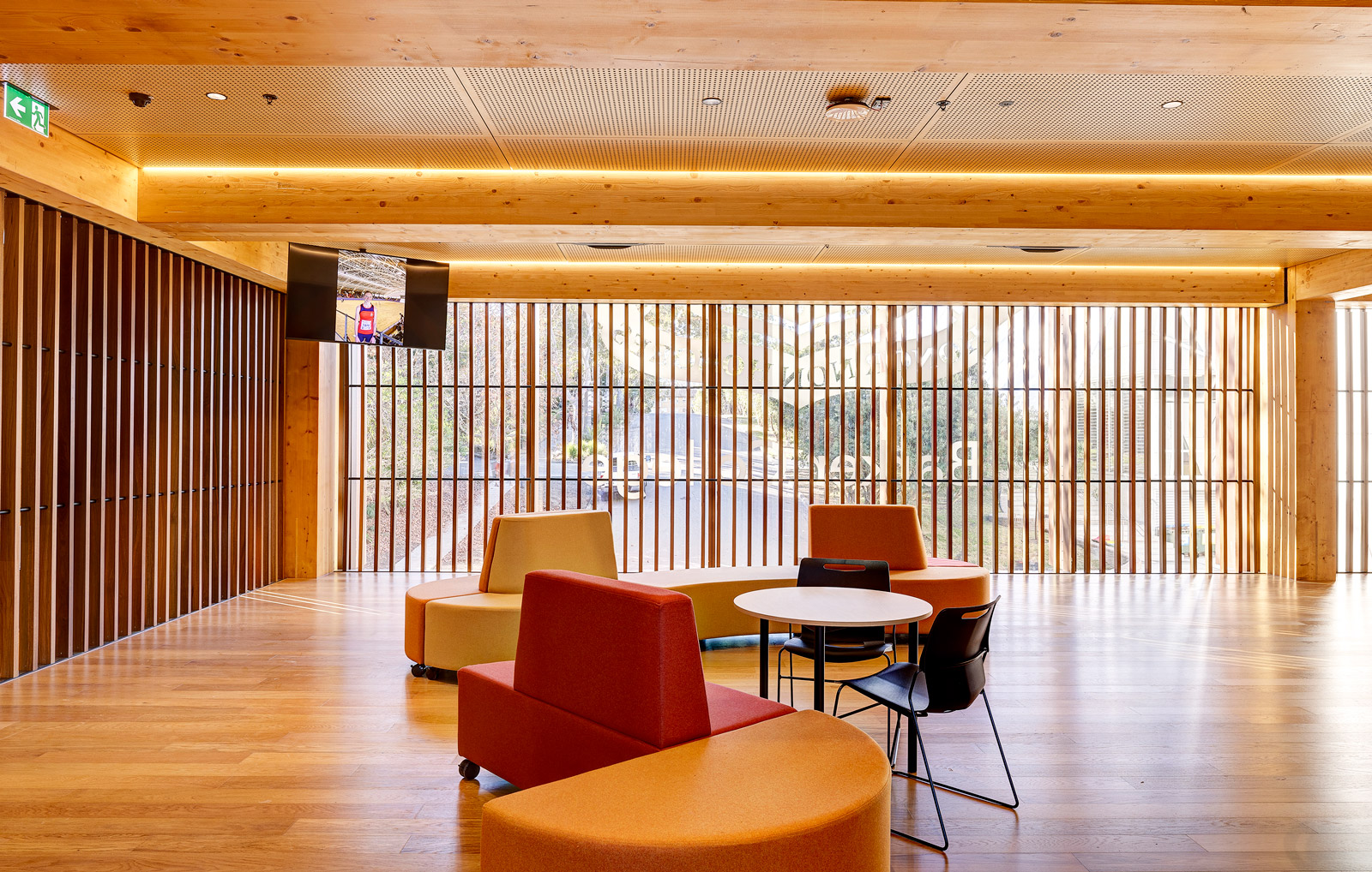
Furniture Tip: In group working areas, consider soft furniture in orange upholstery to encourage discussion and collaboration. Look at our Jelly Bean Ottoman or Showtime Curved Lounge.
Getting Practical with Colour
Our designers at BFX firmly believe in thinking creatively about using colour in learning environments, going beyond the walls to consider how it can be used in furniture, carpet or rugs, décor and even learning resources.
Below is their advice when designing a new, or refurbished space.
1. Get the walls right and the rest will follow
Many professionals recommend painting the wall behind the teacher a different colour from the other walls.
The main teaching wall, which houses the whiteboard or projector screen, should be in a medium tone of green or blue.
This serves multiple purposes:
- To relax students’ eyes
- Promote concentration
- Draw attention to the front of the room
- Provide effective contrast to the chalkboard and teaching materials
Side and back walls should use subtle hues that enhance concentration. However, pure white walls are proven to result in negative psychological effects, such as anxiety, disruptive behaviours, lack of focus, and depressive moods.
Achieve balance with neutrals – soft white, beige, grey and natural elements
Keeping the walls neutral, but not necessarily white, allows you to use other complementary colours for rugs, chairs and soft furniture without overwhelming the senses.
Warmer neutral colours like sandstone or light beige can provide a foundation for walls, ceilings, shelving and tabletops that give teachers flexibility to add appropriate accent colours that suit the subject they are teaching, or in primary classrooms, use colour to create different zones.
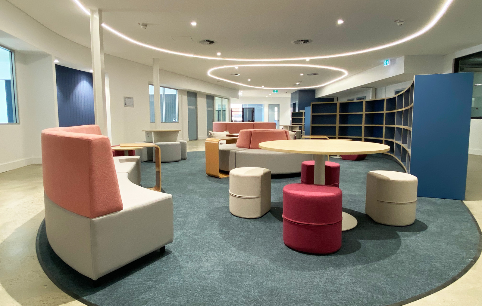
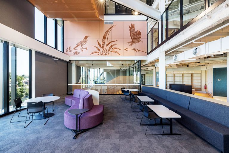
Furniture tip: Use a combination of natural timber and coloured finishes for furniture that is inviting and offers the right level of focus, calm or creativity, like in this Showtime Pavilion Lounge Setting.
1. Get to grips with combinations and contrasts
Using combinations of colours carefully can reduce monotony and keep a space stimulating for learners. However, there are a few caveats:
- Avoid using too many colours together as that can strain the brain’s cognitive abilities. Two to three colours work best.
- The overuse of a single colour can lead to negative consequences. For example, too much blue can be depressing, and though yellow generally inspires cheerfulness and creativity, too much can produce stress.
- Excessive use of bright, energetic colours like red, orange, and yellow can overstimulate so keep them for accents.
At BFX, you’ll see how we’ve combined colours in our upholstery designs to achieve the right balance. Look at our project gallery for some great examples.
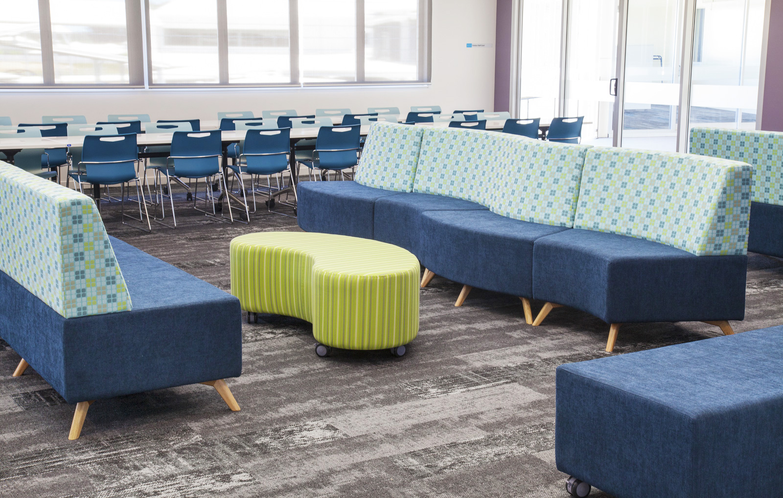
Dark grey with blue or timber finishes with pale green are popular colour combinations for our customers.
Using Contrasts
For most students, high contrasts are stimulating while lighter tones promote focus. Therefore, the learning environment should incorporate various intensities of colour.
Use stronger shades and contrasts (for example, dark purple or blue with yellow) on furniture which doesn’t have a large surface area and where students aren’t required to focus their eyes for long periods, for example, stools, sofas or shelves. Use more muted combinations on floors and walls.
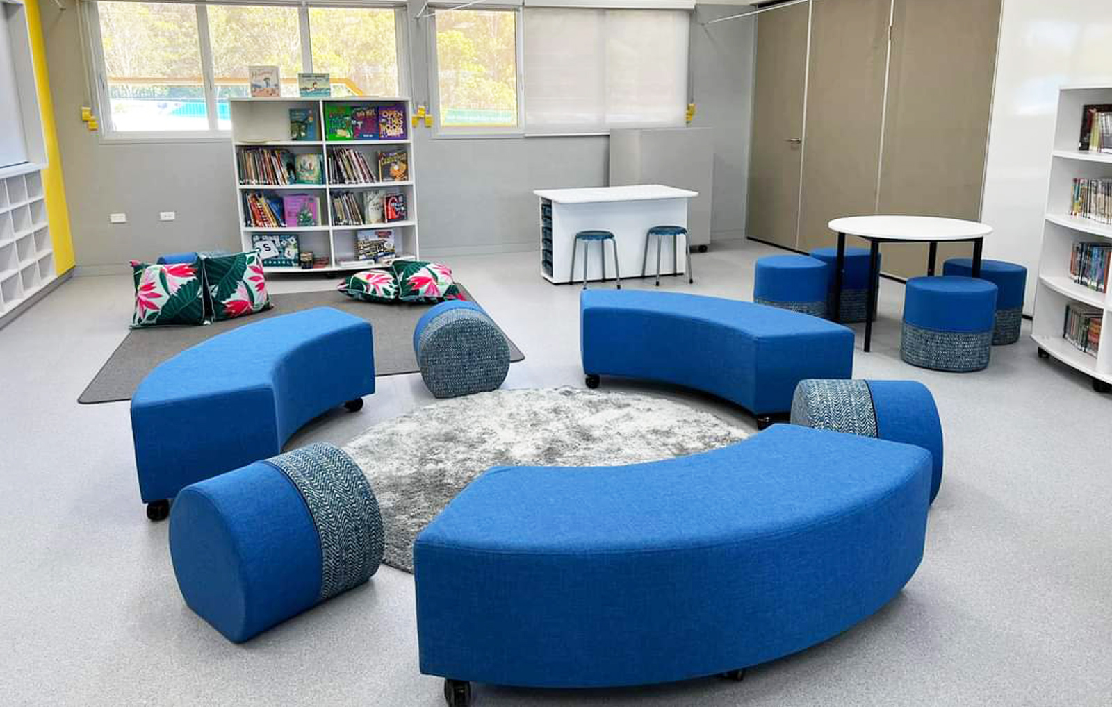
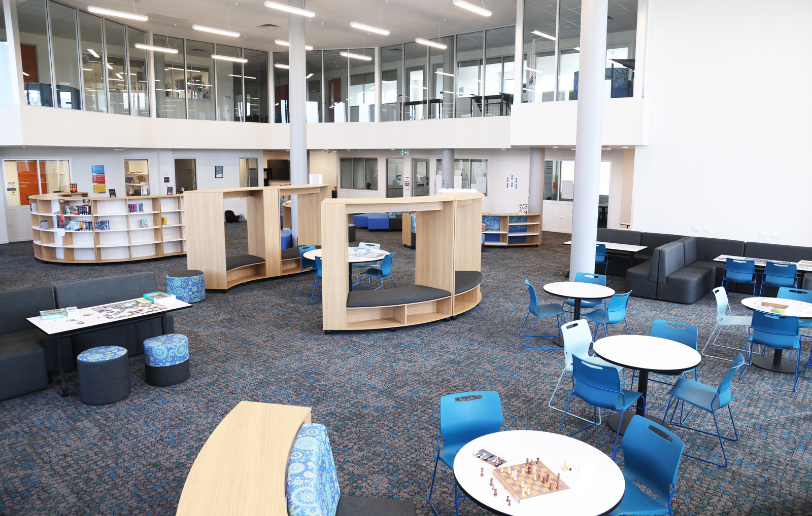
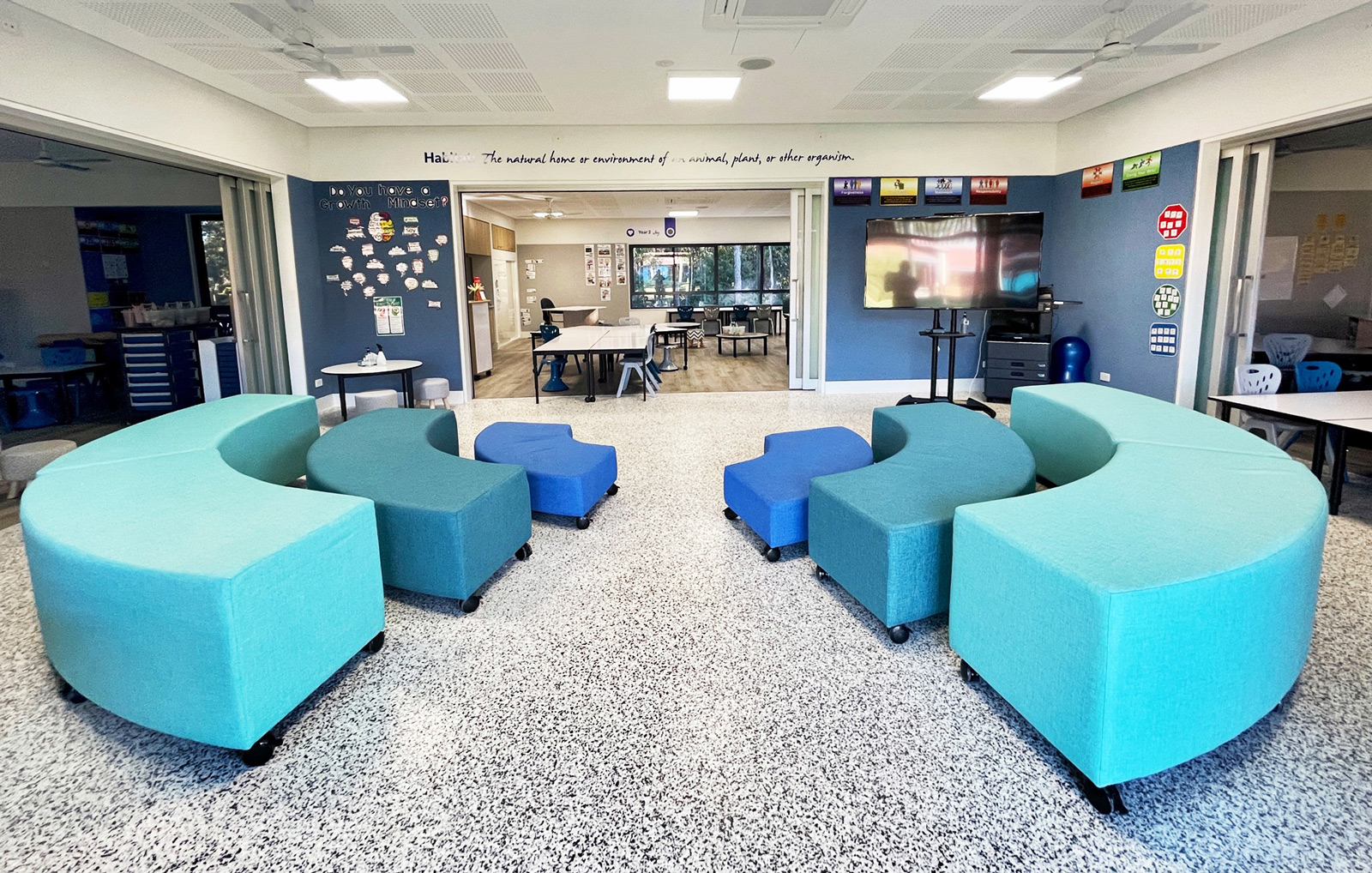
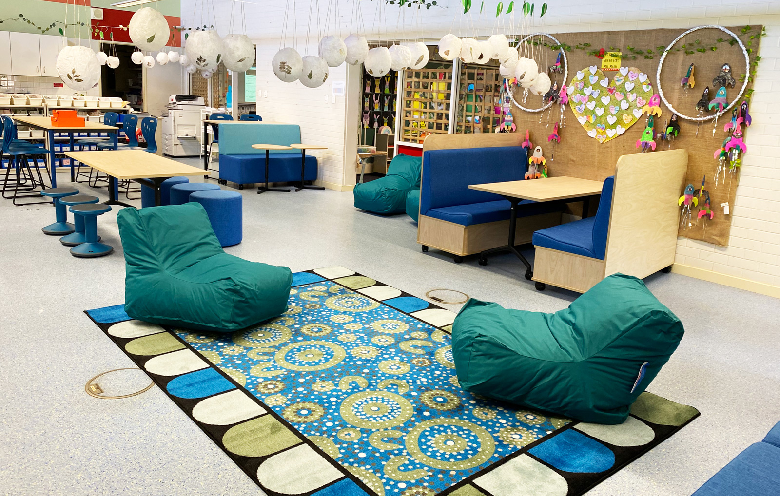
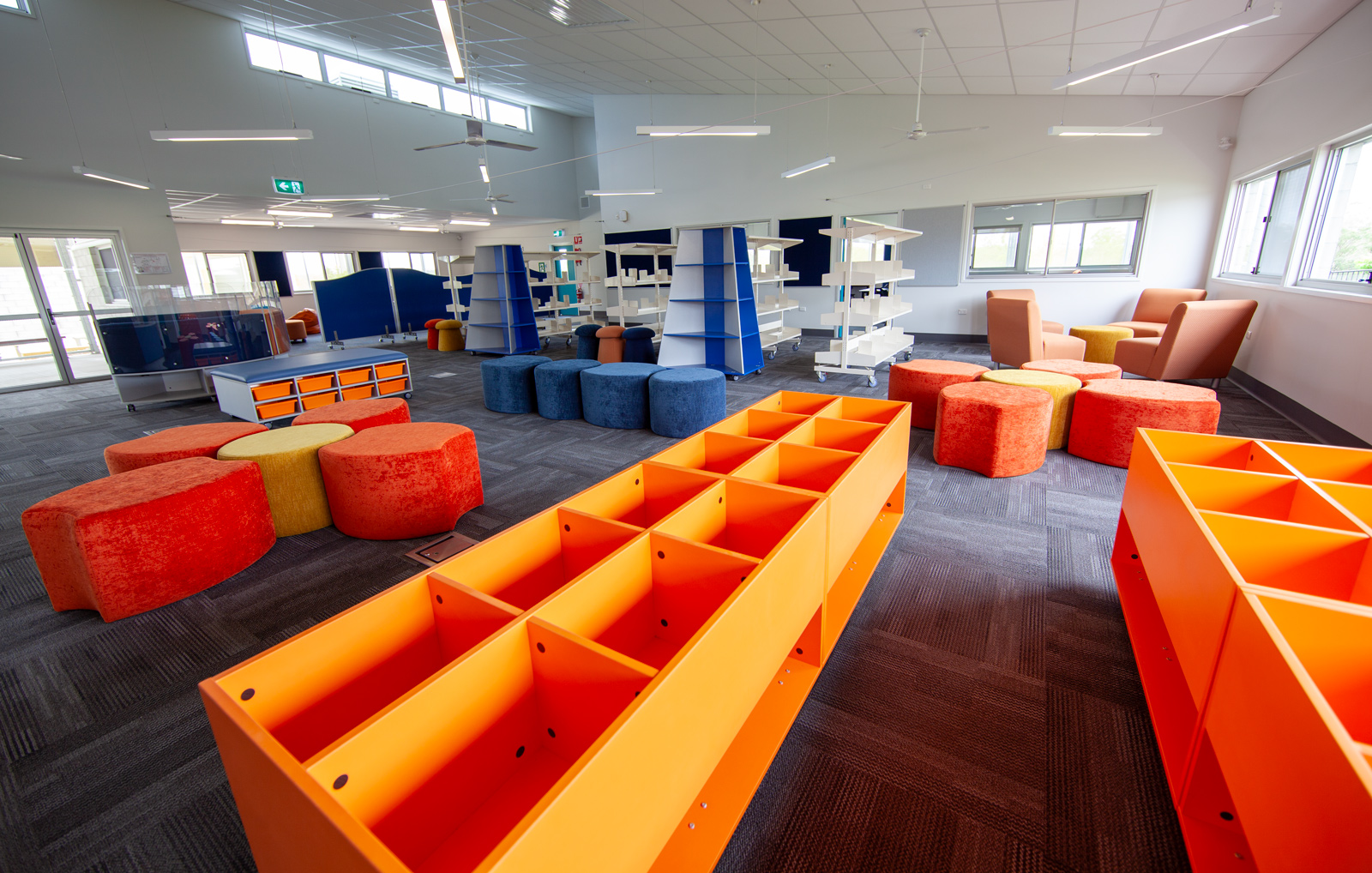
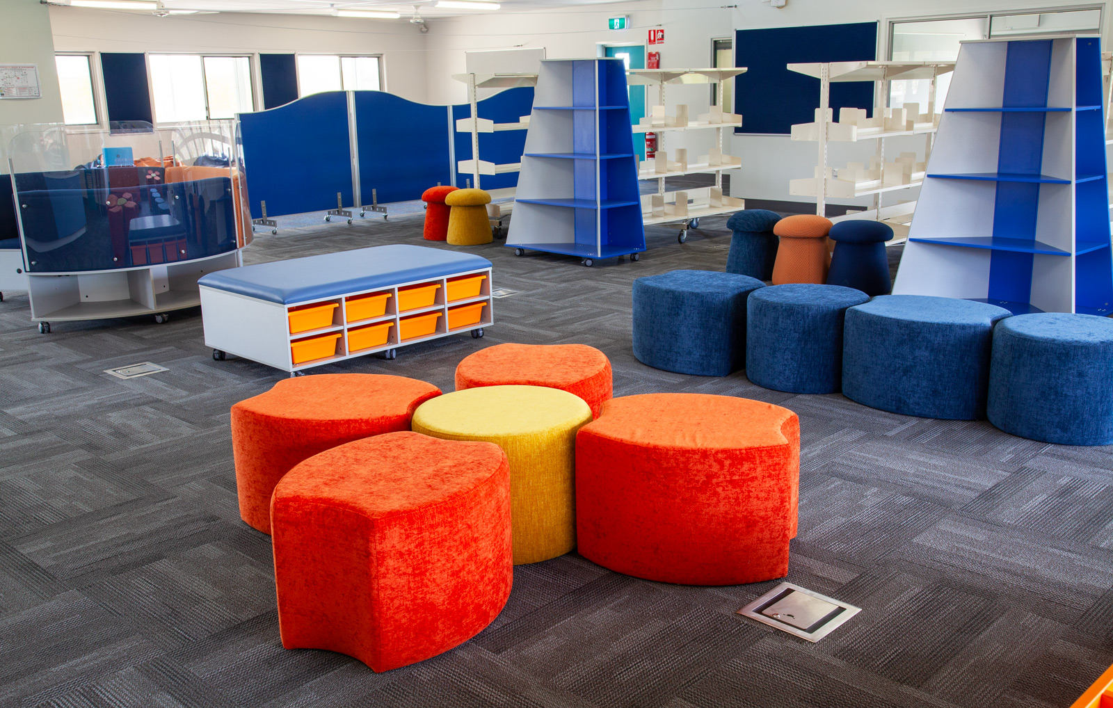
Contrasting colours can, however, be used very successfully in large spaces like libraries and resource centres and primary classrooms to create zones for different purposes, such as reading, group work, or art.
When zones aren’t required, we often recommend using different shades of the same hue to create interest without jarring the eye. You can see how we achieve this for Mt Barker Primary School and Mel Maria Catholic Primary School.
Partner with BFX for Colourful Learning Environments that Learners Love
For over 20 years, BFX has been leading the way in creating furniture and learning environments that blend functionality with comfort and colour psychology. Our designers and consultants continually review research and trends in ergonomics, learning environment design and pedagogy so that we can work with you to create spaces that empower students and teachers – contact us today.
References
“How to Use Colour Psychology in Classroom Decor to Boost Learning”, Teacher Professional Development, August 2024, Colour Psychology | How to Use in Classroom Decor | Teacher Professional Development
“Exploring the Impact of Colour on Classrooms: Colour Experts Perspective”, PPG, March 2020, https://www.ppg.com/en-US/about-ppg/color-in-classrooms
“Coloring the Classroom.” School Planning & Management, December 2013, webspm.com/Articles/2013/12/01/Coloring-the-Classroom.aspx.
Rhinehart Neas, Linda M. “The Use of Color in Kindergarten Classrooms.” Bright Hub Education, www.brighthubeducation.com/teaching-elementary-school/121471-the-importance-of-color-in-kindergarten-classrooms/
Daggett, Dr. Willard R.; Cobble, Jeffrey E.; Gertel, Steven J. “Color in an Optimum Learning Environment.” International Center for Leadership in Education, March 2008, williammeurer.com/wp-content/uploads/2017/09/Color-in-Learning-Environment-W.-Dagget-2008.pdf.
Barrett, P.S.; Zhang, Y. “Optimal learning spaces: design implications for primary schools.” October 2009, Optimal learning spaces: design implications for primary schools (worktribe.com)
“Functional Color and Design in Education Environments.” Architectural Record, August 2014, CE Center – (bnpmedia.com)